Sonámbulo Estudio Creativo
Corporate website for a creative studio with scroll-driven animations, interactive capability showcases, and a dynamic case study portfolio.
Full design and development of the corporate website for Sonámbulo Estudio Creativo, a multidisciplinary creative studio specializing in branding, route-to-market strategy, and digital products. The site uses scroll-triggered animations, sticky sections, and responsive interactions to communicate the studio's capabilities.
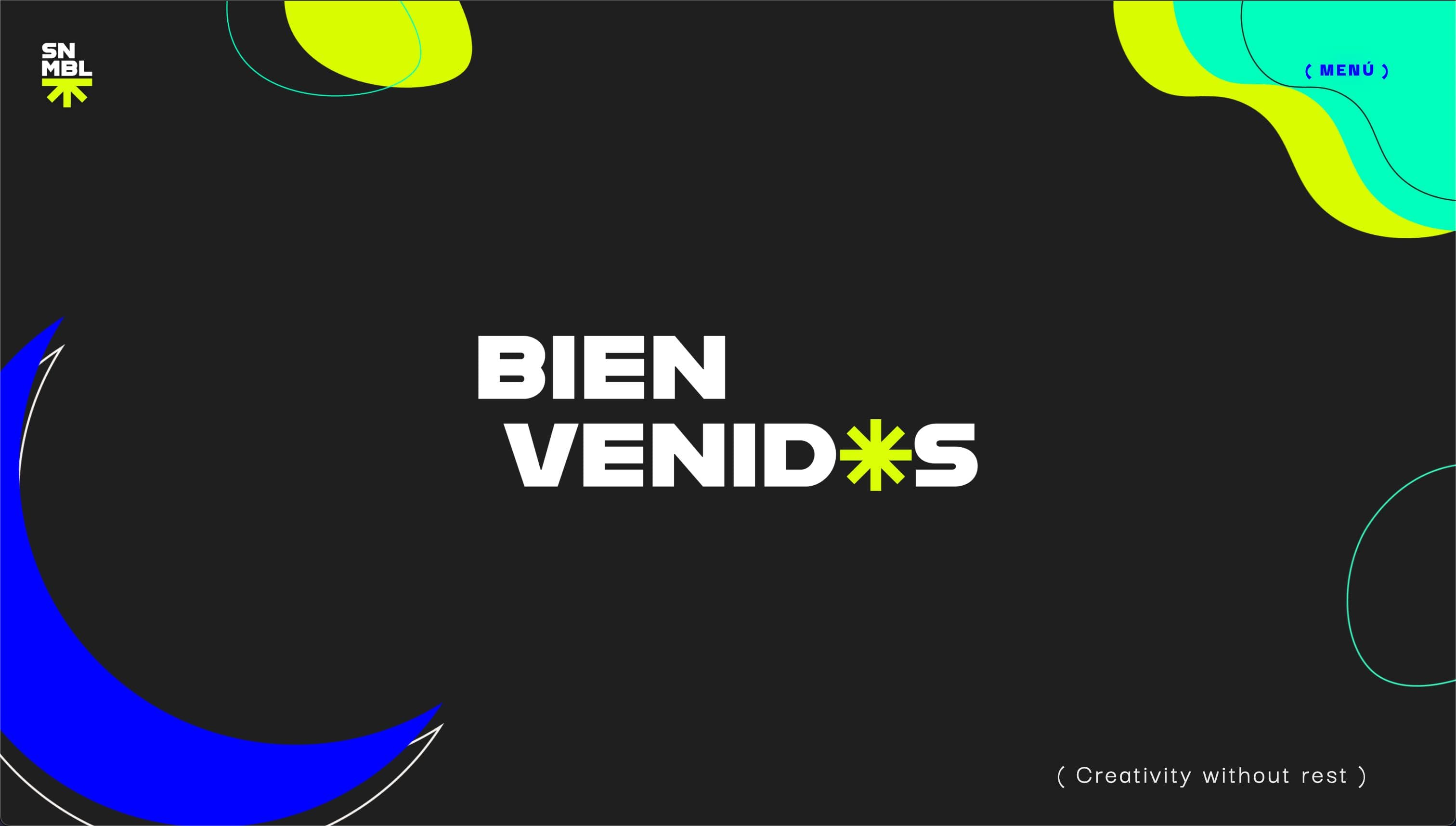
Gallery
Project Overview
Sonámbulo Estudio Creativo is a multidisciplinary creative studio that calls itself a “super group of creatives, advertisers, marketers and idea nerds.” They work across branding, route-to-market strategy, and digital products. The website needed to reflect that energy: not a standard corporate brochure, but an experience that communicates what the studio does through how the site itself behaves.
Animation Architecture
The site is built around scroll-driven interactions. Rather than decorative transitions, animations serve a structural purpose: they control how content reveals, how sections connect, and how the user discovers the studio’s capabilities.
Scroll Progress System
A custom hook tracks viewport scroll position and maps it to animation progress values. This drives sticky sections where content transforms as the user scrolls: text morphs, images slide in, and the value proposition unfolds step by step without requiring clicks or navigation.
Performance Strategy
Multiple animated elements running concurrently can easily drop frames. The site maintains 60fps through:
- GPU-accelerated transforms via Framer Motion’s
motioncomponents - Animation batching to avoid layout thrashing
- Intersection Observer-based activation so off-screen elements don’t consume resources
- Next.js Image with lazy loading for heavy visual assets
Key Sections
Hero and About
A sticky scroll section where the studio’s positioning reveals progressively. As the user scrolls, text blocks transform and images transition, telling the story from “who we are” to “what we believe” without a single page navigation.
Capabilities
Three areas of specialization presented as interactive cards:
- SNMBL Channel Development - Business strategy and trade marketing
- SNMBL Data & Intelligence Center - Dashboards and web/mobile development
- SNMBL Ideas Lab - Creative strategy and brand building
Each card expands on hover (desktop) or tap (mobile) to reveal detailed service descriptions.
Dynamic Portfolio
A case study system with per-client hero sections, responsive image carousels, insight cards with varied layouts, and fluid navigation between projects.
Technical Details
Frontend
- Next.js 14 with App Router and React Server Components
- TypeScript for type safety across the component tree
- Framer Motion as the animation engine, with
useScroll,useTransform, anduseInViewhooks - Custom hooks for scroll tracking, device detection, and intersection observation
Responsive Interaction Layer
The site detects input type (touch vs. pointer) and adjusts interaction patterns accordingly. On desktop, cards respond to hover with 3D perspective transforms. On mobile, the same cards use tap-to-expand with optimized touch gesture handling. A single component codebase serves both experiences through conditional interaction hooks.
Design System
- Cohesive visual identity using the studio’s brand colors (lime, blue, ink)
- Montserrat and Darker Grotesque typography
- Asterisk-based iconography as a recurring visual motif
- SCSS with component-scoped modules and shared variables
The Challenge
- Orchestrating complex scroll-driven animations without sacrificing performance
- Building a sticky scroll system where content transforms as the user navigates
- Supporting both touch and hover interactions across devices
- Keeping 60fps with multiple concurrent animated elements
The Approach
- Framer Motion with custom scroll progress hooks for GPU-accelerated animations
- Custom sticky section system with progress tracking and content morphing
- Device detection layer that swaps interaction models between touch and pointer
- Lazy loading, Next.js Image optimization, and animation batching
Results
- Immersive web experience running at 60fps across devices
- High Lighthouse scores for performance, accessibility, and SEO
- Dynamic portfolio system for presenting client case studies
- Mobile-first design with native touch gesture support
Impact
On a computer the cards react to your cursor; on a phone, to your touch. It is the same code, and the site works out which one you are using. The animations follow your scrolling and switch off once they leave the screen, so nothing stutters.
Project Details
Objective
Design an immersive website that communicates the studio's value proposition through motion, structure, and storytelling, turning a corporate site into an experience.
Theme
Modern corporate with bold lime accents and fluid animations.
Date
November 13, 2025